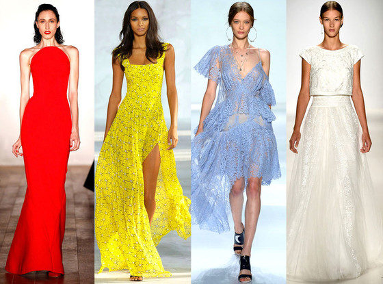
In the words of Antonia O’Brien, leading fashion correspondent, (as told to Women Fitness) “For me, spring/summer ’14 is about embracing brights and being brave; why not wear a mono-colored outfit for a sharp evening look? Or if you are more minimal, tonal shades of cream and white look fresh and chic when wore top-to-toe. Sporty luxe is a sleek style that everyone can tap into via a silky bomber jacket, pleated mini skirt and trainers (if you can’t stretch to Chanel, go for New Balance.)”

Fashion Colors this Spring-Summer’14 takes a modern twist by pairing soft pastels with vivid bright to create a colorful equilibrium. Confident women, designers use color to refresh, revive and defy conventional wisdom.
In the words of Leatrice Eiseman, Executive Director, Pantone Color Institute® “This season, consumers are looking for a state of thoughtful, emotional and artistic equilibrium. While this need for stability is reflected in the composition of the palette, the inherent versatility of the individual colors allows for experimentation with new looks and color combinations.” |

Placid Blue: It can be serve as a neutral color, tranquil, calmness and one that works with every other color. Brides can be found choosing this shade of blue for her Georgia wedding and placid blue works well with every other color in the color spectrum. This mood-mellowing tone can also be seen in some of our favorite home remodels as decorative accents, washed walls, and architectural details.


Hemlock: Similar to the verdant shade of springtime foliage, Hemlock, a summery, ornamental green, provides a decorative touch that’s very different from the greens of recent seasons. A Hemlock backpack or pastel nails look great accompanying outfits and really pop against black.
Cayenne: This is a high-pitched red that adds a dash of spicy heat to neutrals and heightens the excitement when mixed with Freesia. Cayenne adds instant warmth and cheerfulness when added in fashion, designs or interiors.
Freesia: This tropical, floral-inspired shade of blazing yellow is filled with warmth and energy.
Radiant Orchid: This bold shade of purple is a visual counterpoint to Violet Tulip. It is a color that inspires confidence and emanates great joy, love and health. It is a captivating purple, one that draws you in with its beguiling charm. The best complementary color for orchid purple is yellow. However, if you’re looking for a little vibrancy, try wearing it with orange, coral, teal, hot pink and fuchsia.
Dazzling Blue: This is a scintillating shade of blue–the polar opposite to Placid Blue. While spring is traditionally a time for floral and pastels, 2014 will see dazzling blue gracing the spring wardrobe.
“Summer 2014 is somehow already filled with light blue and orange shades. I love the tranquillity of blue and the fierceness of orange for spring.” says Tamara Kallinic, fashion expert and blogger in an interview to Women Fitness.
When selecting your core neutral colors, keep in mind that dark fabrics recede and make the wearer look thinner, and light fabrics advance and make the wearer look bigger.
Source: http://www.pantone.com/